
Case Studies
Liquidlogic • Kayak Manufacture
Opportunity
During a time of major acquisition and consolidation in a booming paddle sports market, several industry leaders broke off on their own to form a new kayak company that aligned with their morals and vision. In doing so, they partnered with Windham Designs to develop this new image. That image? To rage against the mainstream corporate direction, remain true to its principles, and shape an authentic kayak company in touch with the sport, its consumers, and retailers.
Platforms
Branding • Marketing • Sales
Separator
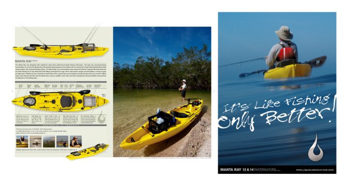
Logo Design • Catalog Design • Sales Collateral • Merchandising • Point-of-Sale • Website Design • Lifestyle Photography • Trade Show Booth Design
Creative Solutions
Our positioning was to return to the grassroots passion of an industry that had lost track of its origins. It was a moment in time when customer service had been replaced with hold music and automated phone tree options. Liquidlogic was different. They remained focused and connected to the paddlers who use their kayaks.
We wanted everything to reflect this energy. We emphasize breathing life back into the paddlesports industry with innovative new products, inventive product categories, and new ways of doing business that is truthful and honest. We wanted our new logo to be a simple statement that was bold, clean, and pure — something notable that would stand the test of time. Tribal markings influence the logo mark to reflect kayaking’s origins — a simple and graphical water drop that is unfiltered and identifiable.
Results
Liquidlogic launched onto the scene and was a leading contender in the marketplace within just a few years. Within 10 years, the company was acquired, but the core principle, to remain connected to the sport, remains intact today.